
Alright, folks, listen up! When it comes to making your website shine, picking the perfect font is like the secret sauce. It’s all about grabbing attention, keeping things readable, and leaving a lasting impression. In this article, we’re gonna spill the beans on the top ten fonts that’ll take your website from drab to fab.
So buckle up and get ready to level up your design game!
- Best Font for Formal Design Proxima Nova Super Family
- Best Font for Fashion Website Loretta Display
- Best Versatile Font Layfort
- Best Font for Art & Craft Website Lemongrass Script
- Best Comic Font Loyola Round Pro
You might also like: Namecheap Review – The Best Web Hosting in 2023?

Meet the Best Font for Website
Get ready to meet Fontspring, the go-to spot for finding the crème de la crème of fonts. They’ve got the top 10 fonts for websites that are guaranteed to make your design game strong. So let’s dive right in and check out these beauties!
Proxima Nova Super Family
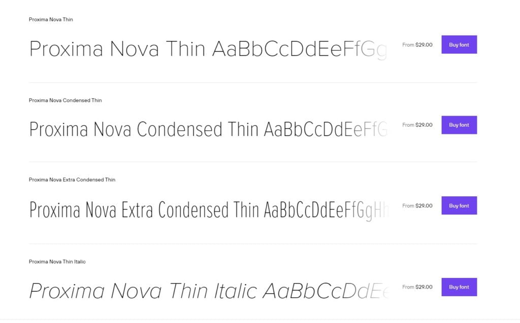
🏢 Foundry: Mark Simonson Studio | 🔢 Fonts: 48 | 💡 Released: 2014 | 📝 Style: Sans Serif | 🖌 Designer: Mark Simonson
Let’s talk about Proxima Nova, the font family that’s shaking up the typographic scene. It’s like a revamped version of the good ol’ Proxima Sans from back in ’94, but this time, they’ve gone all out with a whopping 48 OpenType fonts. Can you believe it? That’s a lot of font power right there!
Now, here’s the deal: Proxima Nova comes in three widths—Proxima Nova, Proxima Nova Condensed, and Proxima Nova Extra Condensed—and each one comes with a whopping 16 fonts. That’s right, you’ve got eight weights and their matching italics for each width. Talk about options!
When it comes to style, Proxima Nova straddles the line between those classic typefaces like Futura and the cool Akzidenz Grotesk. It’s got a bit of that humanistic touch mixed with a dash of geometric flair. Trust me, it’s a winning combo that’ll make your designs pop.
You might also like: HostPapa Review – Features, Pros & Cons, Pricing in 2023
Loretta Display
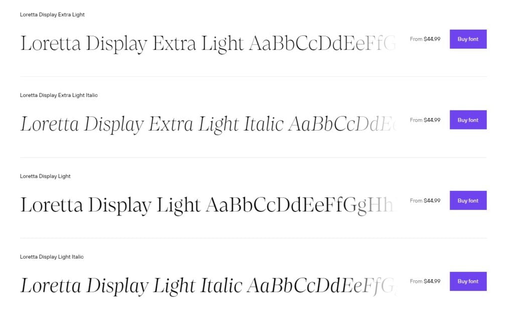
🏢 Foundry: Nova Type Foundry | 🔢 Fonts: 12 | 💡 Released: May 1, 2023 | 📝 Style: Serif | 🖌 Designer: Joana Correia, Abel Martins
First things first, Loretta Display is like the big sister of the Loretta font family. It’s designed to shine at larger sizes, perfect for making headlines and grabbing attention. With twelve styles to choose from, you’ve got plenty of options to unleash your creativity and add that touch of elegance to your designs.
The folks over at Nova Type Foundry really nailed it with Loretta Display. Its sharp and precise letterforms give it a polished look that’s hard to resist. Trust me, it’s the kind of font that demands attention and leaves a lasting impression.
What’s great about Loretta Display is that it expands your universe of editorial typefaces. If you’re looking to add some pizzazz to your magazine layouts, book covers, or any editorial project, Loretta Display is your secret weapon. It’s got that timeless elegance that elevates your design and makes it stand out from the crowd.
You might also like: 2023 GoDaddy Review: Does It Live Up to the Hype?
Layfort
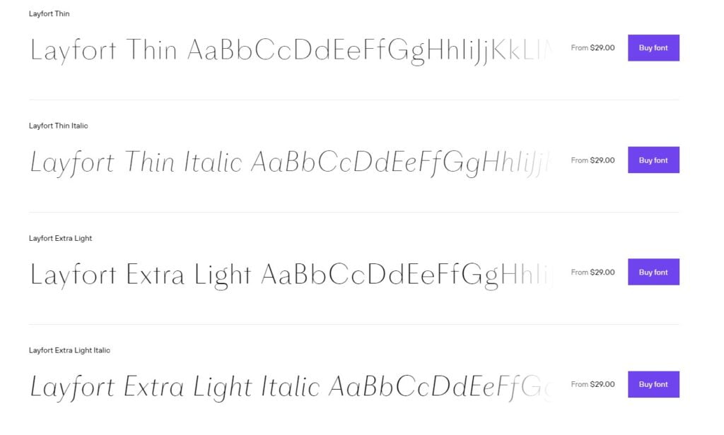
🏢 Foundry: Identity Letters | 🔢 Fonts: 16 | 💡 Released: September 27, 2022 | 📝 Style: Art Deco | 🖌 Designer: Moritz Kleinsorge
Layfort is not your average contemporary sans-serif typeface. It’s got that sturdy industrial vibe mixed with a touch of stylized flair. The varying letter widths create a vivid texture that sets it apart from the crowd. It’s the kind of font that makes a bold statement and demands attention.
But that’s not all—Layfort has some tricks up its sleeve. The true italics are narrower than the uprights, adding an extra touch of elegance and sophistication. It’s the perfect combination of old-style proportions and contemporary design elements.
This font is a true chameleon. It’s elegant enough to grace the fashion, art, and luxury worlds with its presence. Picture it on magazine covers, high-end advertisements, and all things swanky. But don’t be fooled, Layfort is also sincere enough for serious business. It’s versatile and adaptable to fit a range of design needs.
Lemongrass Script
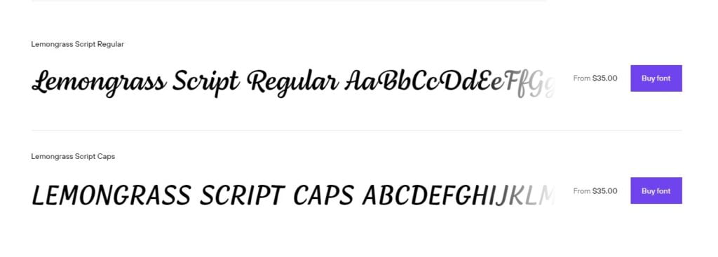
🏢 Foundry: Nova Type Foundry | 🔢 Fonts: 2 | 💡 Released: 2018 | 📝 Style: Brush Display, Brush Script | 🖌 Designer: Joana Correia
To begin, the fluid and interconnected letters of Lemongrass Script perfectly encapsulate the spirit of brush writing. It’s just like strolling down a beach in the warm sunshine, feeling the salty wind on your face. This typeface has a certain allure that makes it difficult to ignore.
Lemongrass Script is most notable for its low contrast and seamless linkages. These aesthetic choices give your writing a soothing cadence that makes it a pleasure to read. Lemongrass Script sparkles and provides a touch of elegance to your material whether you’re using it for branding, packaging, or tiny writing.
Not only that, but Lemongrass Script also comes with a slew of other features that will set your company apart. It has a wide variety of ligatures, swashes, and alternate forms to let you express your individuality via design. Go ahead and make your brand completely unique by letting your imagination run wild.
Loyola Round Pro
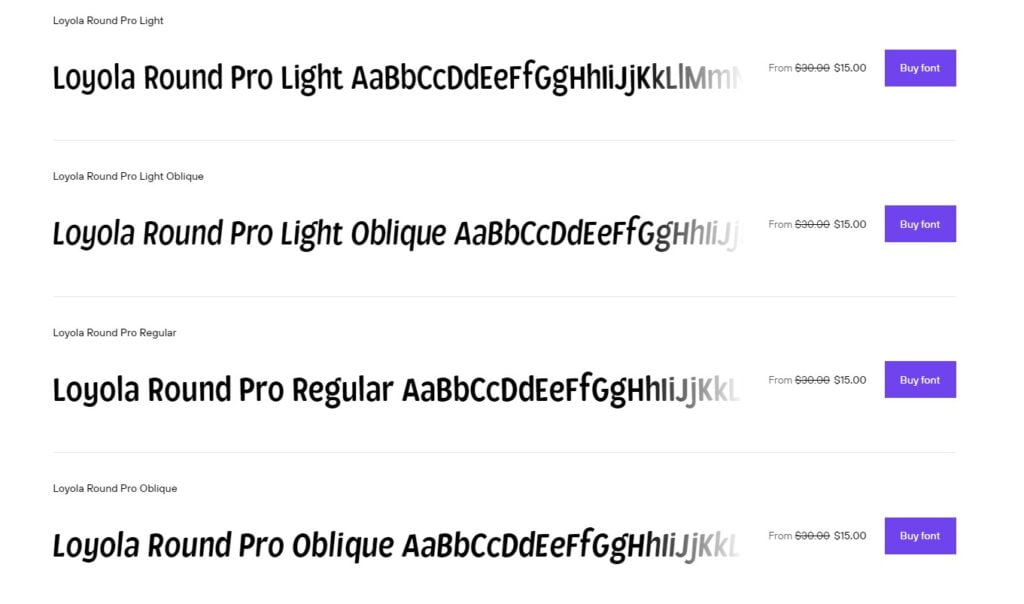
🏢 Foundry: Rodrigo Typo | 🔢 Fonts: 11 | 💡 Released: 2018 | 📝 Style: Comic, Dingbat | 🖌 Designer: Franco Jonas Hernandez, Rodrigo Araya Salas
Get ready to be introduced to Loyola Round Pro, the font family that injects a fun and lively element into your design endeavors. This font is all about embodying playfulness and adaptability, so let’s jump right in and explore the remarkable features of Loyola Round Pro!
First things first, Loyola Round Pro excels at captivating your attention with its diverse range of weights. Offering options from Light to Black, this font provides a spectrum of possibilities for you to experiment with. Whether you desire a delicate and airy touch or a bold and impactful statement, Loyola Round Pro is here to support your creative vision.
But hold on, that’s not all! Loyola Round Pro goes beyond mere letters, as it also includes a delightful set of dingbats. These additional graphical elements add a whimsical charm to your designs. So, if you’re seeking to sprinkle some playful icons or decorative elements throughout your project, Loyola Round Pro is here to fulfill your needs.
1906 French News
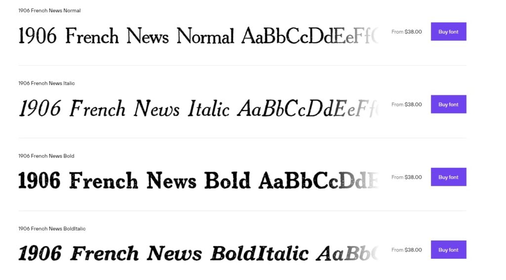
🏢 Foundry: GLC Foundry | 🔢 Fonts: 8 | 💡 Released: 2010 | 📝 Style: Grunge, Historical, Western
1906 French News captures the essence of grit and grunge with its distinctive design. It’s like stepping into a time machine and finding yourself in the era of vintage newsprints and rugged western landscapes. This font family knows how to make a statement.
With eight styles to choose from, 1906 French News gives you plenty of options to play around with. Each style adds its own touch of character and authenticity to your designs. Whether you’re going for a weathered, distressed look or a bold, impactful statement, 1906 French News has got you covered.
Published by GLC Foundry, this font family pays homage to the rich history of French news typography. It’s a nod to the past, infusing your designs with a touch of nostalgia and authenticity. If you’re working on historical projects, vintage-inspired designs, or want to bring that wild west vibe to your work, 1906 French News is the perfect companion.
Charcuterie Design Kit
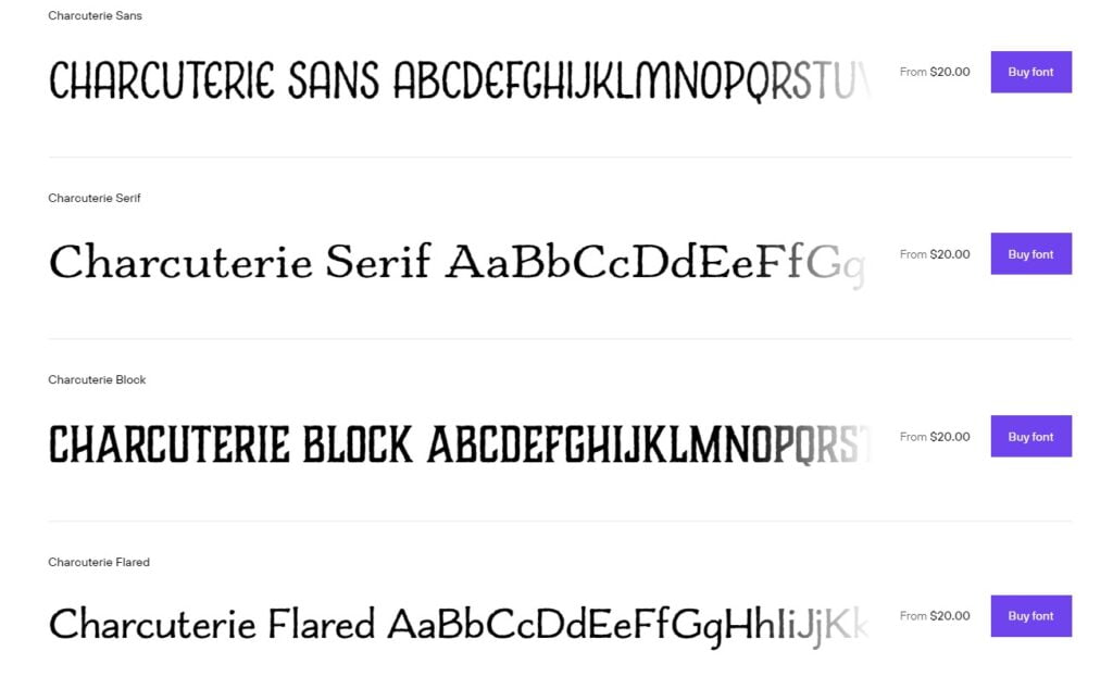
🏢 Foundry: Laura Worthington | 🔢 Fonts: 22 | 💡 Released: 2014 | 📝 Style: Art Deco, Display Sans, Display Serif, Hand Display, Kids, Script, Western, Dingbat
This font family is an ambitious and rare undertaking, offering a feast of ten distinct yet interconnected typefaces, along with three decorative/ornamental typefaces. Let’s dig in and explore the mouthwatering features that Charcuterie has to offer!
Charcuterie is not your average font family—it’s a comprehensive collection of typefaces that will satisfy even the most discerning typographic palate. Each typeface within the family has its own unique personality and style, allowing you to mix and match to create the perfect combination for your projects. Whether you’re looking for classic elegance, engraved detailing, or playful cursive scripts, Charcuterie has got you covered.
Pragmatica
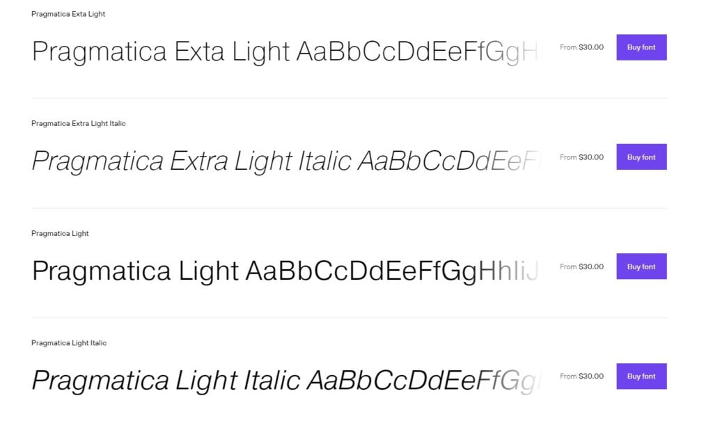
🏢 Foundry: ParaType | 🔢 Fonts: 44 | 💡 Released: 2013 | 📝 Style: Display Sans, Sans Serif | 🖌 Designers: Isabella Chaeva, Manvel Shmavonyan, Alexander Tarbeev, Vladimir Yefimov
Pragmatica traces its roots back to the Encyclopedia-4 type family of the Polygraphmash type design bureau, which was developed by Vladimir Yefimov and Isay Slutsker in 1987. Inspired by the elegance of Helvetica, Pragmatica incorporates the mathematical accuracy of 19th-century Grotesque designs, taking the sans-serif category to new heights.
What makes Pragmatica truly remarkable is its timelessness. It has proven to be a reliable choice for designers seeking a versatile and legible typeface. Whether you’re designing for print or digital, Pragmatica adapts seamlessly to various layouts and contexts, adding a touch of professionalism and clarity to your designs.
Carisma
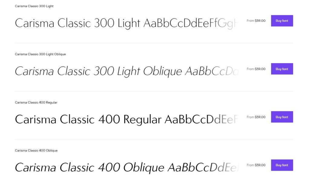
🏢 Foundry: CastleType | 🔢 Fonts: 30 | 💡 Released: 2013 | 📝 Style: Display Sans, Sans Serif | 🖌 Designers: Jason Castle
Carisma is the perfect embodiment of timeless beauty. It combines the grace and elegance of classic capital letters with the sleek simplicity of clean-cut, geometric lowercase characters. The result is a harmonious balance that exudes sophistication in every curve and contour.
What sets Carisma apart is its attention to detail. The sensuous curves, subtle contrasts, and delicately tapered terminals add a touch of warmth and personality to the font. It’s the kind of typeface that catches your eye and invites you to take a closer look.
This font truly shines in creating an understated, modern aesthetic. Its clean lines and geometric precision give it a contemporary edge, while the elegant touches bring a touch of tradition and refinement. Whether you’re designing for a high-end brand, a luxury publication, or simply aiming for a sophisticated look, Carisma is your go-to choice.
Sofia Pro
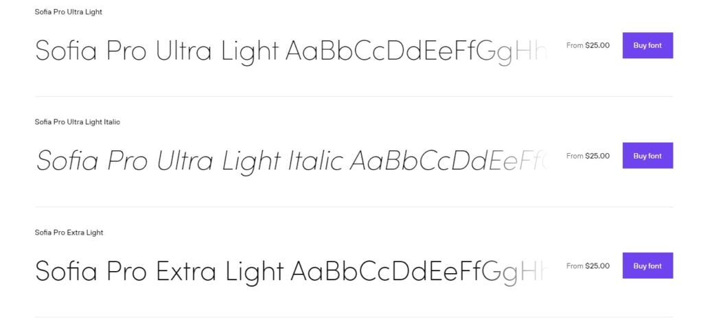
🏢 Foundry: Mostardesign | 🔢 Fonts: 17 | 💡 Released: 2012 | 📝 Style: Sans Serif
Originally created in 2009 and completely redesigned in 2012, Sofia Pro has emerged as a popular choice among professionals in the graphic industry, earning it well-deserved accolades. Let’s dive into the captivating features that make Sofia Pro a standout font family.
One of the defining characteristics of Sofia Pro is its beautifully rounded curves and open terminals. These design elements give the font family an elegant, friendly, and contemporary appearance. Sofia Pro effortlessly balances geometric precision with a touch of softness, creating a harmonious visual experience.
The higher x-height of Sofia Pro sets it apart from other fonts in its class, ensuring excellent readability even at small sizes. Whether you’re designing business cards or mobile applications, Sofia Pro remains clear and legible, making it an ideal choice for projects that demand tiny readability.
You might also like: Typeform Review 2023: Is It A Great Survey Tool?
Why Choosing Fontspring?

When it comes to selecting fonts for your projects, Fontspring stands out as the go-to platform for several reasons. Let’s explore why choosing Fontspring can make your font browsing and licensing experience a breeze.
Fontspring takes the hassle out of font licensing by carefully reviewing and flagging any onerous requirements on your behalf. They ensure that the font licenses cover the most common rights and align with what designers typically expect. With Fontspring, you can browse fonts with peace of mind, knowing that you won’t need a lawyer to decipher the licensing terms.
To make your font exploration even more convenient, Fontspring offers many fonts with free demo versions. These demo fonts are fully installable, allowing you to try them out in any program for testing and comping purposes. It’s a fantastic opportunity to see how the font looks and feels in your designs before making a final decision.
If you ever need assistance or have questions regarding fonts, Fontspring’s support team is readily available. Their friendly and knowledgeable support gurus are just a chat, email, phone call, or tweet away. Whether you have a big concern or a small query, they are there to help. Simply reach out, and they’ll be happy to assist you.
Fontspring also simplifies the licensing process by offering four off-the-shelf licenses that are perpetual and easy to understand. These licenses cover desktop, website, ebook, and application usage, making it straightforward to obtain the appropriate licensing for your specific needs.
Highlights:
⭐ Fontspring carefully reviews font licenses, saving you the trouble of deciphering complex requirements.
⭐ Worry-Free badge guarantees that font licenses cover common rights and expectations.
⭐ Many fonts on Fontspring have free demo versions for testing and comping.
⭐ Fontspring offers friendly and knowledgeable support through various channels.
⭐ Four off-the-shelf licenses (desktop, website, ebook, and application) are perpetual and easy to understand.
You might also like: Atlas VPN Review – Features and Prices in 2023
Final Thoughts
In conclusion, Fontspring is a reputable platform that offers a wide range of high-quality fonts, convenient licensing options, and excellent customer support. With their extensive collection, worry-free licensing, and the availability of free demo versions, Fontspring makes it easy for designers and creatives to find the perfect fonts for their projects. Whether you’re looking for classic or modern styles, Fontspring is a valuable resource that simplifies the font selection and licensing process. So, if you’re in need of fonts, Fontspring is definitely worth considering for a smooth and enjoyable experience.
Fun Fact!